
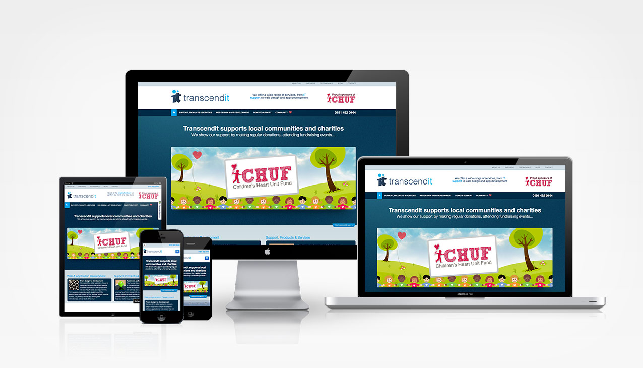
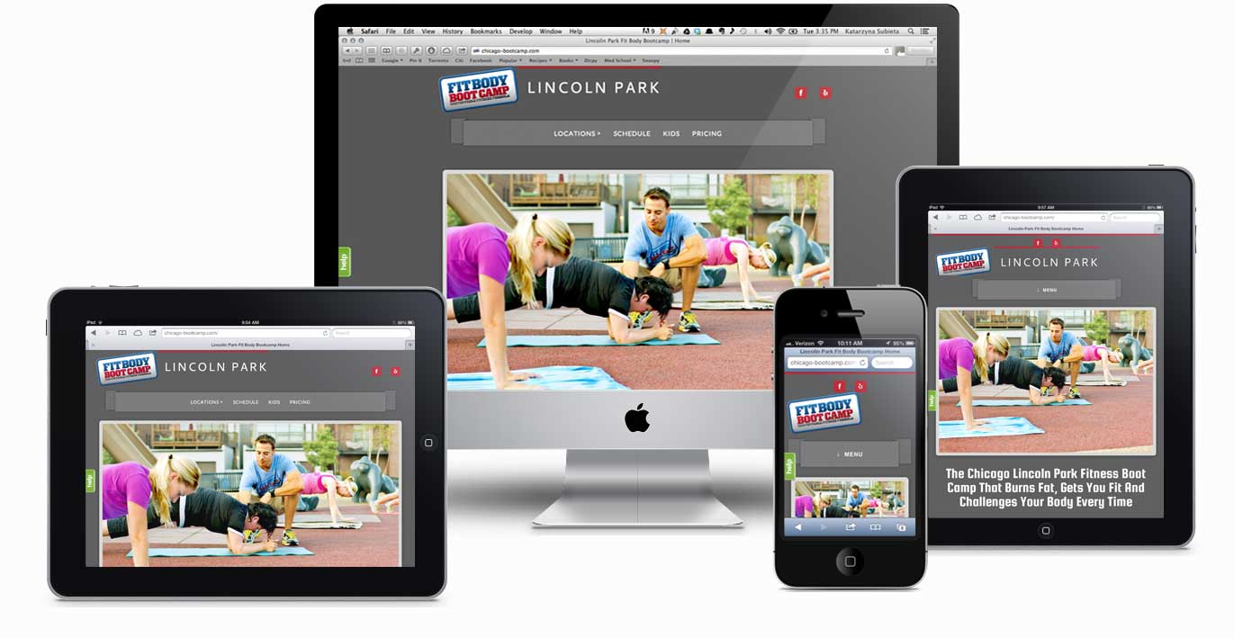
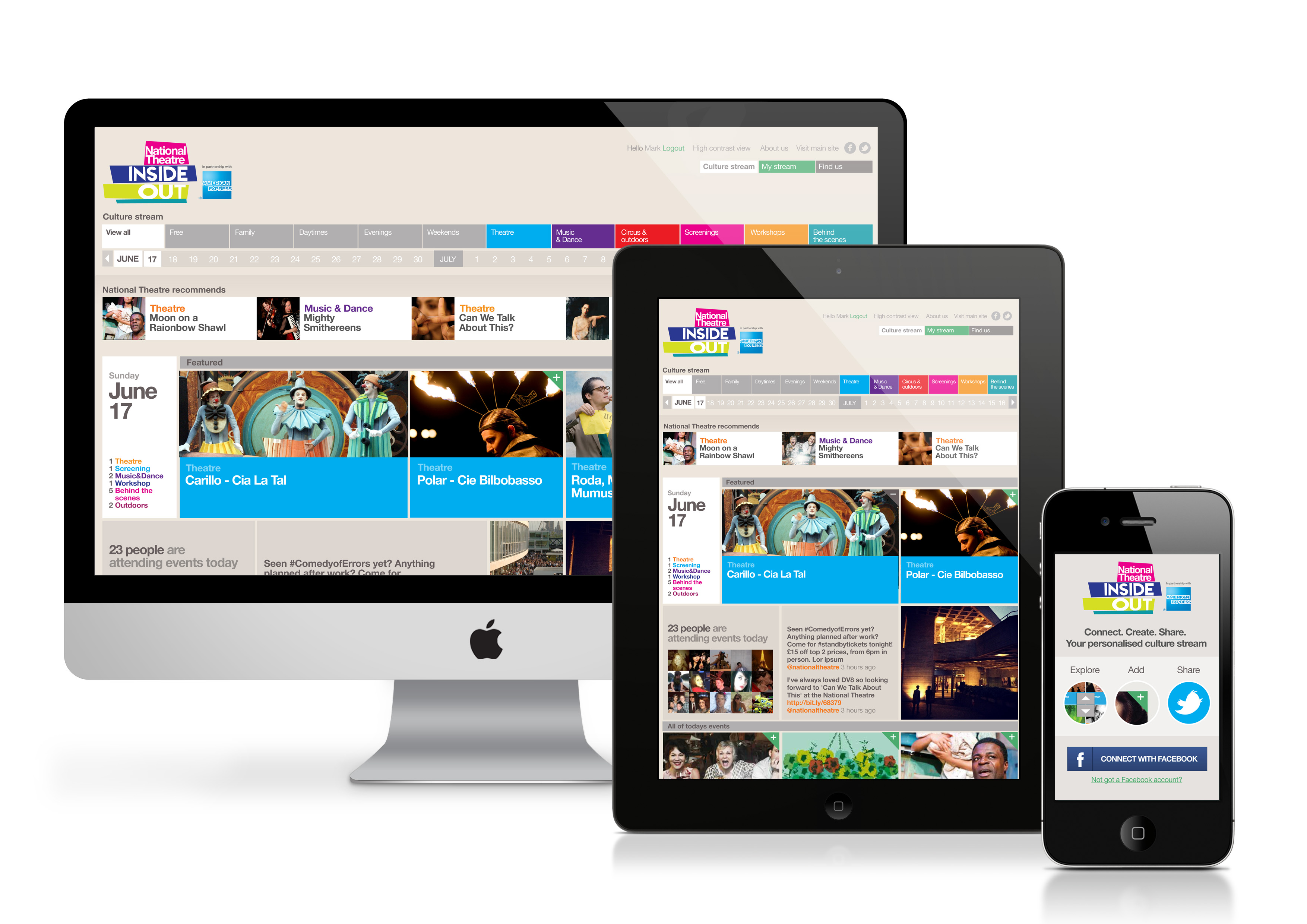
The World Wide Web is different today than what it was just five years ago. Today, many people access the internet via a mobile device. Samsung alone has approximately 25 devices in different sized screens. Now if you mix in other devices like the iPad and iPad mini, then you will have a smorgasbord of web devices. How do mobile marketers take advantage of these devices? I believe that the mobile marketer first needs to understand the basics of responsive web design so that they can better devise a mobile marketing strategy for their client. Responsive web design is where the actual website responds to the size and shape of the screen it is being rendered on. The website manipulates itself to the dimensions of the screen for the best possible viewing.

Pictured above is the many ways we access the web. But if there are so many ways, how can we keep track of these? Responsive web design is exactly how we can do so. That is why mobile marketers need to thoroughly understand responsive web design to best serve the client who is interested in mobile marketing over responsive web design. Below are examples of responsive web sites followed by a video that will best explain the gist of responsive web design.


 Send to Kindle
 About Ed Rivera

Let's Connect